How Museums Shape What We Call ‘Good’ Art: An Explainer
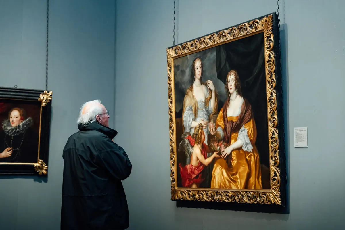
Stand in front of a painting in a large museum and something happens before you have formed an opinion. The room is quiet. The canvas sits at eye level, lit like a stage, flanked by two works that make it look inevitable. A small card tells you the artist’s name, the year, the donor. By the time you decide whether you like it, you have already been told, in a dozen quiet ways, that it matters. That is not a conspiracy. It is the ordinary machinery of taste, and museums run it better than anyone.
Understanding that machinery does not ruin the pleasure of a good exhibition. It sharpens it. Once you can see the decisions behind the wall, you can argue with them — and you can start noticing what your own eye does when nobody is arranging the room for you.
Curation is an argument built out of walls
A curator does not simply select good objects. A curator builds a sequence, and sequences produce meaning. Put a rough 15th-century panel next to a polished 16th-century altarpiece and you have just written a small essay about progress, skill and time — whether or not anyone intended it. The wall does the talking.
The classic example is Alfred Barr’s 1936 exhibition at the Museum of Modern Art in New York, which laid out modern art as a flowchart of influences and offshoots. The diagram has been criticised, revised and argued over for decades, but its logic stuck: modern art as a family tree with a clean trunk. That is a curatorial choice masquerading as a fact of nature. Anyone who has since walked into a gallery expecting art history to move in a straight line is feeling the after-effects.
Watch for this the next time you visit. Ask what a room is claiming. Is it telling you that one movement caused another? That a country is a style? That a decade ended in 1959? You do not have to reject the claim. Just notice that it is one.
The quiet persuasions of display
Most of what shapes judgement happens below the level of language. The white cube — bare walls, even light, no distractions — is not a neutral container. It is a convention with a history, one that flatters certain kinds of work and quietly sabotages others. A minimal sculpture thrives in it. A devotional object, a textile, a piece of ceremonial regalia can look inert or merely decorative in the same conditions.
Consider how much work these choices do:
- Height. Work hung at eye level reads as important. Work above or below the line reads as context, decoration or an afterthought.
- Light. Spotlights create drama and imply value; flat, even light suggests documentation rather than art.
- Space per object. Generous breathing room is a form of respect. Cramming implies bulk, archive, anthropology.
- Framing. A heavy gilded frame pushes a picture toward antique; a bare canvas edge pushes it toward the contemporary.
- Sequence. What you see immediately before a work changes how you read it. The same painting can look bold or tired depending on its neighbour.
None of this is dishonest. It is editing, and editing is how exhibitions become legible. But legibility is not the same as truth, and the two get confused constantly.
Labels, dates and the small words that rank things
Wall text is where a museum speaks in its own voice, and where it reveals its hierarchies most plainly. Compare a label that reads “Rembrandt” with one that reads “Attributed to the circle of Rembrandt.” The object may be nearly identical. The status is not. Attribution language — “workshop of,” “after,” “formerly attributed to,” “anonymous” — is a ranking system in miniature, and it shifts as scholarship changes.
Pay attention, too, to what gets stated and what gets left out. A date range tells you the object is hard to place. A long list of previous owners tells you the institution is confident about its history. A label that describes an object’s function in a sentence or two, rather than its aesthetic qualities, is quietly telling you it belongs to ethnography rather than to art. Those decisions have been contested for decades, and the argument is worth following.
The tombstone test
A useful habit: read only the tombstone card — name, title, date, medium, credit line — before you look at the work, then look, then read the full text. You will notice how much of your first impression came from the label rather than the object. Most people are surprised.
Acquisition, storage and the making of a canon
The canon — the short list of names that supposedly define art — is built in back rooms. It is built by what a museum buys, what it accepts as a gift, what it can afford to conserve, and what it has space to show. A work in storage for thirty years is, for practical purposes, invisible. It cannot influence taste, cannot be taught, cannot be reproduced in a catalogue and cannot inspire anyone.
That means donors and trustees shape art history far more than most visitors realise. A collection assembled around one family’s preferences becomes, two generations later, the standard against which everything else in that field is measured. Meanwhile entire traditions — textiles, ceramics, printmaking, work by artists outside the commercial gallery system — sit at the edges of the story not because they lack quality but because nobody built the rooms for them.
The halo of the institution
Museums lend authority the way banks lend money. A borrowed exhibition, a national pavilion, a prize shortlist, a place in a permanent collection: each one transfers a little institutional credit to an artist or an object. The mechanism works on visitors too. Studies of framing and context have long suggested that people rate the same object differently depending on where they encounter it, and anyone who has seen a modest sketch presented reverently in a grand hall knows the feeling.
This is why blockbuster shows and biennials matter beyond ticket sales. They do not just display a version of art history; they push it forward. And it is why the fashions that sweep through museums — the sudden appetite for a previously neglected generation, the revival of a medium that was dismissed a decade earlier — are worth reading as arguments rather than as news.
When the canon corrects itself
Institutions do change, though usually under pressure. Reattributions demote famous names. Galleries get rehung to break up tidy national stories. Museums have removed the names of controversial donors from wings and lobbies after public campaigns. Labels get rewritten to say plainly what was once described euphemistically. Historians of the future will look at today’s displays and find the same blind spots we find in 1950s wall text — that is how the process works.
How to look past the frame
You do not need special training to read a museum critically. You need a few habits, practised until they are automatic.
- Enter with a question. “What is this exhibition arguing?” is a better frame than “What should I see?”
- Look first, read second. Give the object thirty seconds before the label gets a word in.
- Note the room, not just the work. Ask what the neighbours are doing to the piece in front of you.
- Find the missing. Before you leave, ask who is not in these rooms, and what medium is barely represented.
- Check the credit line. Gifts, purchases, promised bequests: it tells you how the collection came to look like this.
- Write down one disagreement. A visit you argue with stays with you far longer than one you merely admire.
None of this is meant to make you cynical about museums. They remain one of the few places where you can stand in front of an object with no obligation except attention, and that is worth protecting. But the next time a painting strikes you as obviously, effortlessly great, it is worth asking how much of that certainty arrived with the wall, the light and the small printed card — and how much came from your own eyes.
Photo: Miguel González / Pexels


You Might Also Like
A practical look at when the phone in your pocket beats the camera in your bag for daily visual storytelling — and when it quietly falls short.
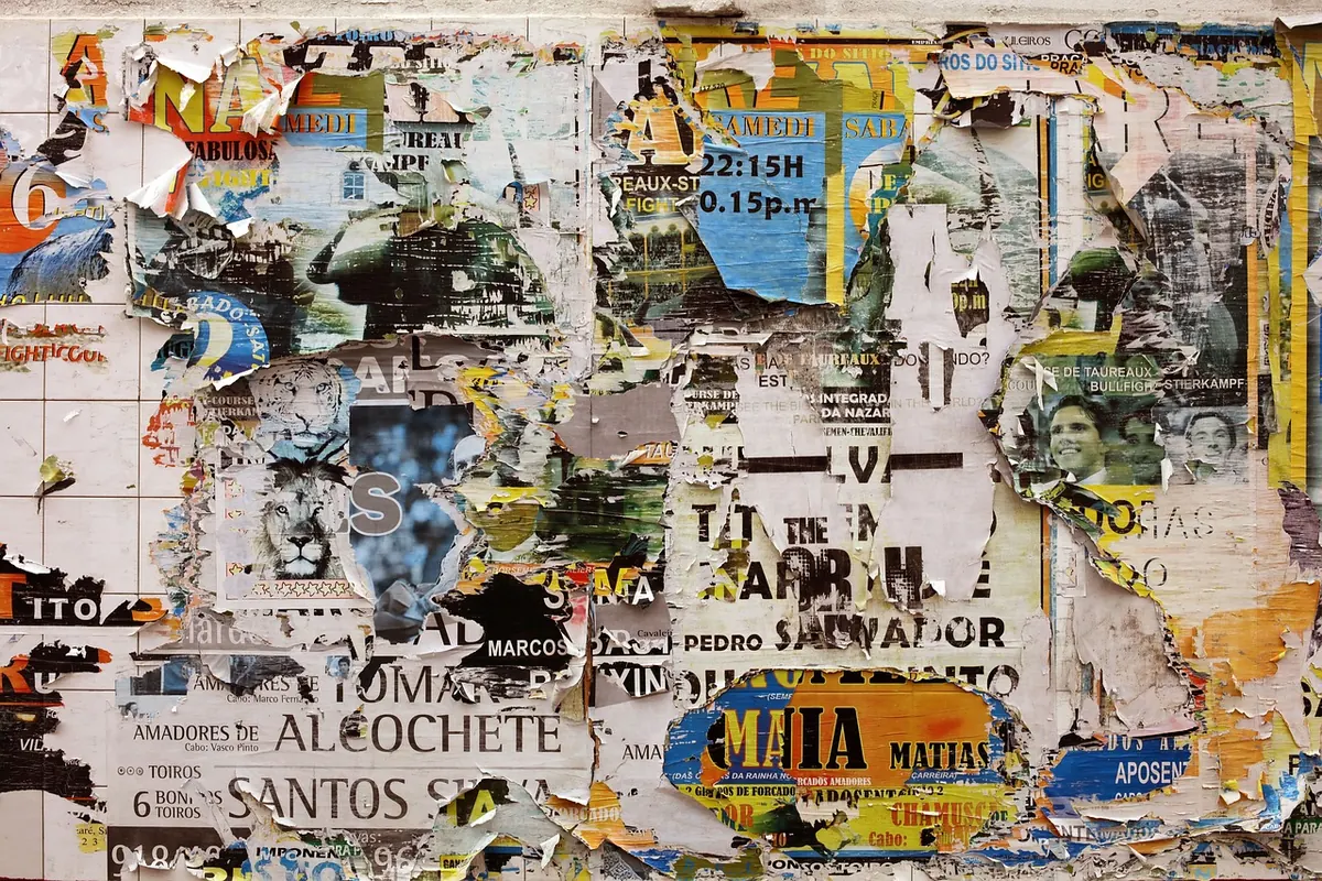
Street posters are the least curated layer of a city’s visual life — a record of who speaks, how loudly, in what typeface, and to whom.