
Seasonal Visual Culture: How Holidays Change Public Imagery
The same high street can look like two entirely different places in the space of a few weeks. In late October it is grey, cluttered, functional: bins, bollards, a bus shelter with scratched glass. By the middle of November the trees are wrapped in warm-white cable, the lamp posts carry wreaths, and the shop windows have turned into small theatres lit from below. Nothing structural has changed. What changed is the imagery.
Seasonal celebration is one of the most reliable forces shaping public visual culture. It works on a schedule, it repeats, and it reaches almost everyone who walks through a town centre, whether or not they observe the holiday being marked. That combination is rare. Understanding how it works makes the city easier to read, and it gives anyone who designs for the public — a shopkeeper, a venue manager, a community group — a set of usable patterns.
The Street Becomes a Set
Municipal decorations do something subtler than decorate. They convert infrastructure into a stage. A plane tree that has been invisible all year becomes, once it is strung with lights, a meeting point: “I’ll see you by the tree” is a sentence that only works for six weeks. A pedestrian crossing becomes something you linger near rather than hurry across.
Watch how the light temperature shifts. Ordinary street lighting tends toward the cool and neutral, chosen for visibility and cost. Seasonal installations add warmth — amber, gold, a bit of red — and the effect on behaviour is immediate. People look up. They stop. They take photographs badly, with the phone tilted. The street has become a place to be seen in rather than a place to pass through.
There is also a timing problem built into the form. In northern latitudes the decorations go up while the afternoons are still dim and wet, so the lights read as an act of defiance against the light rather than a celebration of it. In warmer places the same installations can look incongruous against a bright blue sky. Good schemes work with the local dark, not against it.
Shop Windows and the Grammar of Display
The shop window is the most disciplined piece of seasonal design in public life, because it has to sell something. A good window dresser changes the props, the backdrop, the lighting and the plinths, and leaves the merchandise recognisable. The coat is the same coat. The story around it is not.
What separates a strong window from a cluttered one is usually restraint. Two or three colours, not six. One gesture — a branch, a paper arch, a single hanging star — rather than five competing ones. Texture doing the work that sparkle cannot: wool, raw wood, kraft paper, brushed metal. And light aimed deliberately, from low and to one side, so the product keeps its shape.
Small businesses can borrow the grammar without the budget. Painted cardboard, a borrowed ladder, a length of coloured ribbon and a decent clamp light will take a window further than a box of assorted ornaments. Photograph the window from the pavement at night before you commit to it; the view from inside the shop is almost always flattering and almost always wrong.
The Seasonal Palette in Advertising
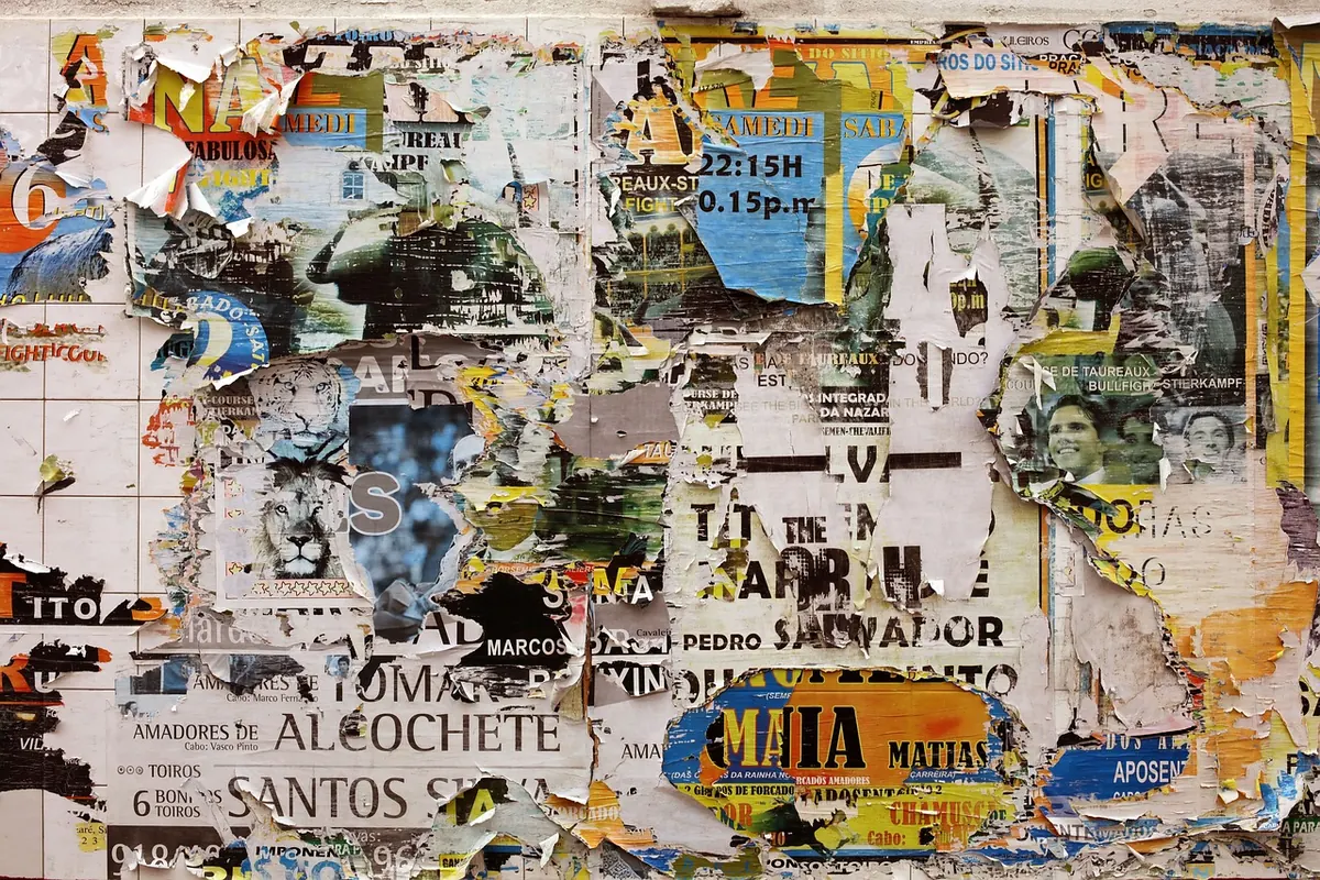
Commercial imagery runs on colour shorthand. Winter campaigns move toward amber, oxblood, deep green, cream and a metallic accent. Spring goes pale and cool. Late October turns orange and black with a deliberate roughness, all torn edges and dusty texture. None of this is subtle, and that is the point: the palette has to register before the copy is read.
There is a practical constraint behind the look. Seasonal campaigns are planned and photographed months ahead, often in the opposite season, which is why so much winter advertising leans on studio snow and controlled warmth rather than anything resembling an actual street. Snow, in fact, has become a convenient fiction — a visual shorthand for festivity that most of the audience has never experienced at that time of year.
The counter-move is worth noticing too. Some brands resist the palette entirely, running dry, wry, deliberately under-decorated work: a plain white background, a single object, a line of small type. Against a noisy visual field, restraint becomes the loudest thing on the page.
Shared Symbols, Different Readings
Seasonal symbols accumulate rather than replace. The evergreen tree carries pre-Christian associations, was absorbed into Christmas, and now reads as broadly secular in most commercial contexts. The carved pumpkin travelled from Irish turnip-lanterns to North American pumpkins and back across the Atlantic as a Halloween standard. The lantern appears in Ramadan displays and in Lunar New Year imagery, doing different work in each.
This layering means the same image can be read several ways at once, and occasionally in opposite directions. Red and gold reads as festive abundance in one frame and as alert or warning in another. A wreath signals welcome on a door and mourning at a memorial. Context, placement and typography carry as much meaning as the symbol itself.
Public decoration also raises a question of who is being addressed. A town square that marks one calendar and no other is making a statement about whose celebrations count as civic. Many councils have moved toward the neutral phrase “winter lights”, and the change in wording quietly changes the imagery: less specific iconography, more abstraction, more emphasis on light and gathering than on any single tradition. Whether that reads as inclusive or as bland is a matter of local argument, and it is an argument worth having in public.
The Morning After
Every seasonal scheme has an exit, and the exit is rarely designed. In the second week of January the decorations come down and leave evidence: cable ties on railings, pale rectangles of gaffer-tape residue on glass, a bare tree with a harness still in it, the skip in the car park. The visual register drops faster than the mood does, and the grey month that follows feels greyer for the contrast.
This residue is part of the seasonal image whether or not anyone planned it. It helps to treat the takedown as part of the install: agree a date, record what you own and where it lives, use fixings that come off cleanly, and store things so they can be used again. Reusable and hired decorations have improved considerably, and a scheme that returns next year will look more confident than a new one bought in a rush.
How to Read a City Seasonally
If you want to watch visual culture change in real time, the seasonal switch is the easiest place to start. Take the same walk at three points — before, during, after — and note what shifts.
- Sequence. Which premises change first? Chain stores usually move earlier and more uniformly; independents arrive later and with more personality. The gap between them is a small map of how a high street is funded and who runs it.
- Palette. Count the dominant colours. A confident scheme holds to two or three; an anxious one adds a fourth and then a fifth.
- Absences. What has been removed rather than added? Empty windows, covered scaffolding and blank hoardings are as informative as lit ones.
- Permanence. Which decorations never come down? A string of lights left up until March tells you something about budgets and staffing.
- Provenance. Is it bespoke, catalogue-standard, or homemade? The three read completely differently at twenty paces, and the difference is usually about care rather than money.
Making It Work Without Overdoing It
For anyone dressing a space on a limited budget, a few rules hold up well. Choose one idea and repeat it rather than assembling a collage. Keep the colours to three and let texture do the rest. Light from below and to one side, and turn off the overhead fluorescents when you do it. Decide in advance when everything comes down and who is taking it down. And leave one thing un-decorated — a bare surface gives the rest of the scheme somewhere to sit.
Seasonal imagery is at its best when it feels like a local decision rather than a delivery. A window, a doorway, a tree at the end of a road: the scale is small, the effect is cumulative, and the whole street reads differently because of it.
Photo: JillWellington / Pixabay

You Might Also Like
A practical look at when the phone in your pocket beats the camera in your bag for daily visual storytelling — and when it quietly falls short.
Street posters are the least curated layer of a city’s visual life — a record of who speaks, how loudly, in what typeface, and to whom.